PBS begins rollout of electric-blue brand refresh
PBS
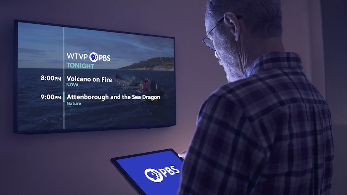
The new PBS brand ID as it appears on smart TV apps on tablets and live broadcast on a full-screen television.
PBS introduced a new logo Monday that’s been redesigned to look good on screens of all sizes.
The refreshed brand launched first on PBS.org and will roll out to broadcast and other digital platforms throughout next year, when PBS celebrates its 50th anniversary.
The logo will appear on air at the top of prime-time shows, in system IDs and some promos. Due to differing timelines for app stores to distribute updates, some app users may not see the changes immediately.
For stations, the launch marks the beginning of a yearlong rollout period, which gives them flexibility to manage the changes as appropriate for their local circumstances, said PBS spokesperson Jennifer Byrne.
The rebranding allows for uniformity of PBS’s brand identity across all platforms with the iconic “P-head” logo in electric blue instead of black. Alongside the logo, the letters “PBS” also appear in blue — in a crisp, custom font called “PBS Sans” that replaces the previous Slab Serif script.
Color has become essential to stand out in a cluttered media landscape, said Don Wilcox, VP, multiplatform marketing and content at PBS, who led the two-year rebranding initiative.
In another change, the round shield encircling the overlapping P-heads was shortened.
“The proportions are better when it shrinks down,” Wilcox said. “It looks better smaller. That makes the logo easier to read across platforms.”
“We live in a multiplatform world and need to light up many screens,” Wilcox said.
The previous black-and-white logo hadn’t had a major makeover since the 1980s. Designed for the broadcast era, the old logo “wasn’t traveling well,” he said. “As the landscape became more cluttered, we knew we needed to do some work to refresh.”
“We have precious few marketing dollars and need the brand to work as hard as it can, to maximize it,” he said.
The global creative consultancy Lippincott completed the redesign for PBS.
PBS chose blue for the logo because it is “the most loved color on Earth and conveys trust and integrity,” Wilcox said. Modern media organizations all embrace color “as a visual cue and way to get noticed.”
“If Netflix owns red and Hulu owns green, PBS will own blue,” agreed Amanda Mountain, CEO of Rocky Mountain PBS in Denver, referring to the streaming providers’ colored logos.
Among other major streaming video services, Amazon Prime Video uses blue and black, while YouTube brands with red. HBO Max, the forthcoming streaming service, has adopted a blue, purple and pink ombre.
Wilcox acknowledged that some stations questioned the color choice, given how the nation’s political divides are defined by blue and red. But the electric blue in the logo is not “Democratic blue,” he said. “Even Fox News has blue in its logo.”
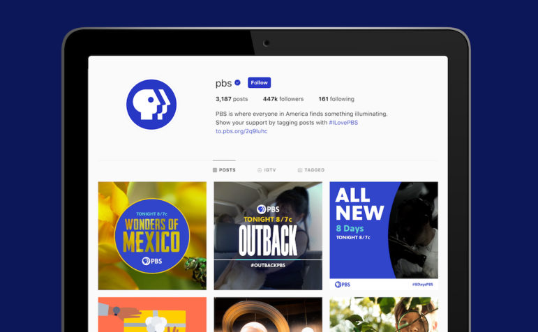
The rebranding extends beyond the logo to the look and feel of new branding promos, station IDs, graphics packages and other creative materials that PBS provides to stations. “It’s more than just a logo, it’s a whole new visual system and design philosophy,” Wilcox said. PBS has developed new brand imagery and photography.
A new on-air spot that Byrne shared depicts a woman in a dappled green forest as she touches a leaf, then opens an artist’s sketch pad. The voice-over chimes, “You’re watching PBS” as the bright blue logo stands out sharply against the green.
Kelly Fink, RMPBS director of creative services, said the Denver-based pubcaster received a $10,000 grant from PBS to integrate the rebranding materials.
“There’s a sense of freshness and modernity,” Mountain said. “Our brand does need to evolve with the time.” She called the new creative “more personal and character-driven, connected with images of people or subjects of PBS content.”
RMPBS’ creative team has a long list of updates, Mountain said, but they will get done over time. “We’ll prioritize our on-air assets, our interstitial breaks,” she said. The station needs to update its outdoor signage and the branding on its stationary and business cards.
The timing of PBS’ rebrand was fortuitous, Mountain said, because the station will be moving into new headquarters. Updates to its branding would have been needed in any case.
PBS provided grants to 79 stations, Byrne said, and aims to fund rebranding grants again next year. It aims to award funds to a total of 100 stations over the course of the grant program.
Wilcox said 70% of PBS member stations will be adopting the new brand identity. Most already use some form of the black-and-white logo, while others plan to add the PBS brand for the first time. A few — KRLU in Austin, Texas, for example — will drop call letters from its branding to become Austin PBS.
The PBS creative team developed “a spectrum of co-branding options, which includes adopting a geographic identifier, like Austin PBS,” Byrne said. The localization isn’t available to stations in some markets, including those with more than one PBS member station. Stations can also co-brand by pairing their own logos with PBS’, she said.
Some stations will just keep the old logo and “see how it goes,” Wilcox said. A small number have not weighed in. “We have tried not to mandate, and to provide as much flexibility as we could,” he said.
Three state networks are among the 11 member stations that will co-brand with PBS for the first time. Wisconsin Public Television will brand as PBS Wisconsin; Iowa Public Television, as Iowa PBS; and Idaho Public Television, as Idaho Public Television PBS. Other stations adopting the localized co-brand are PBS Reno; PBS Fort Wayne; PBS El Paso; Pioneer PBS of Appleton, Minn.; and PBS Texas Tech Public Media, based in Lubbock. WHYY in Philadelphia will co-brand as PBS WHYY.
Other stations that are retaining their names but updating with the new PBS brand color and font include PBS Guam; NMPBS in New Mexico; PBS Charlotte; PBS KVIE in Sacramento, Calif.; KSPS PBS in Spokane, Wash.; KMOS PBS in Sedalia, Mo.; and Texas stations Basin PBS in Odessa and Panhandle PBS in Amarillo.
In updating their own branding materials, the one thing stations cannot do is split the shield logo from the PBS lettering, Wilcox said — “You can’t break it apart.”
“People were breaking the shield off and not using the name, but research shows it is more effective to use them both,” he said.


They have precious few marketing dollars but spent two years to do practically nothing but pick a color? Oh, I forgot, they also needed research to determine that they should put the initials next to it how CBS and NBC do. They must have seen some amazing PowerPoints.
Way more than “picking a color” was involved. Updating everywhere the logo appears on every digital platform in every context so that it is readable and recognizable. Revamping the website. Creating hundreds of digital assets to share across stations. Creating brand guidelines to ensure a consistent voice and visual language.
DOES ANYBODY REALLY CARE?
“Much to do about nothing”